The Exceptional Opportunity Approach

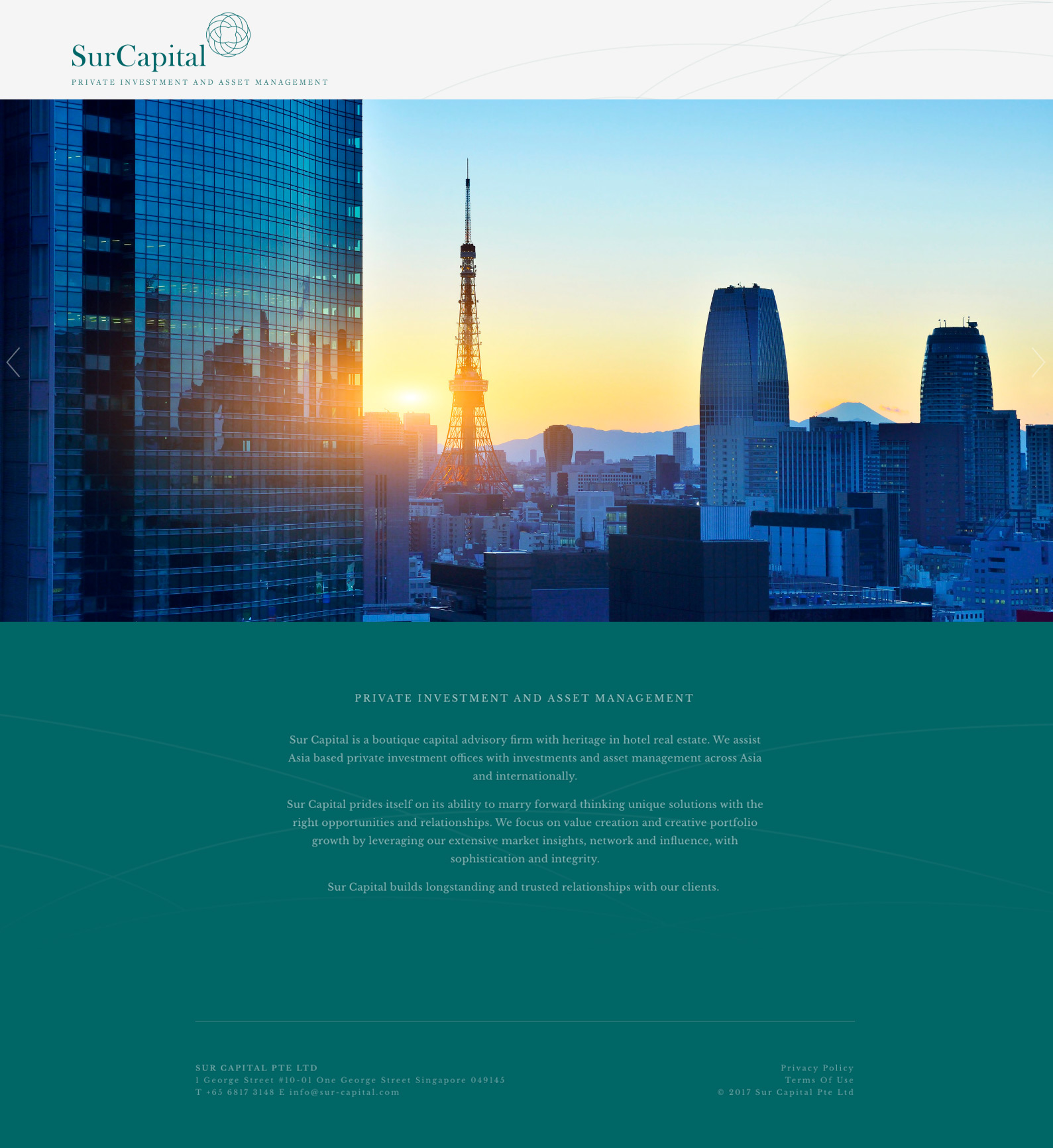
Sur Capital is a boutique capital advisory firm with heritage in hotel real estate. They assist Asia based private investment offices with investments and asset management across Asia and internationally.

The logo brief provided the parameters for this exploration – the logo design should consider industry best practices and traditionally conservative guidelines, but be distinctive and notable with a sophisticated modern accent. It should create intrigue, be distinguished, tasteful, notable and conjure feelings of trust and expertise.

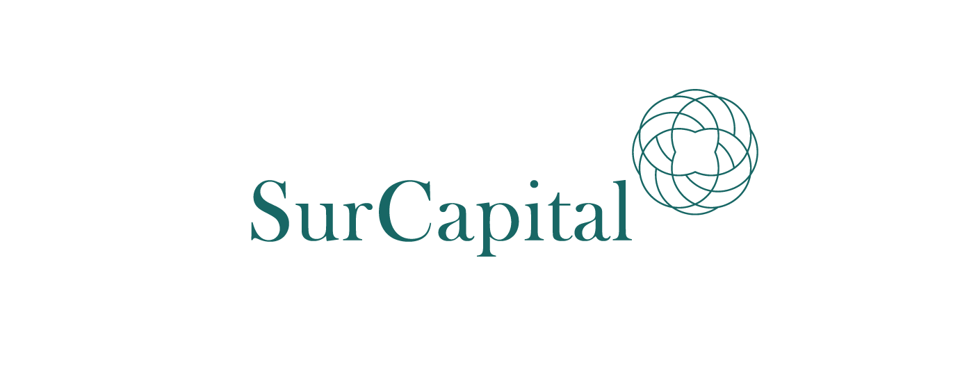
The concept was that of the exceptional opportunity approach – ‘The Sur Capital difference’ captured through symbolism.

The logo is a sophisticated symbol that is made up of 8 intersecting rings that represent Sur Capital’s focus on creative thinking and expertise in matching of solutions to needs. While it is a ‘neutral’ and symmetrical shape, it remains intriguing and is not as simple / cultural / floral enough to be mistaken for a hotel or lifestyle brand. The logo typeface is an understatedly confident serif that is based on Baskerville Old Face. It was chosen for its balanced apertures seen in the negative spaces of S, C, a, u, and its elegant terminals and shoulders that can be seen in sentence case. The colour chosen was the colour of the sea, borrowed from the inspiration for its name the Big Sur.

Task

Logo & Visual Identity and Website Design & Development

  • Scope

    Logo & Visual Identity, Website Design & Development

  • Client

    Sur Capital

Work with me

Got a project?

I can help with – Visual Brand Identity Design, Art Direction & Design (Digital & Print) for Campaigns, Publications and Collaterals, UX Design, Website Design & Development on CMS platforms, Illustration, Copywriting.

Back