


Shaping an identity that balances heritage with innovation
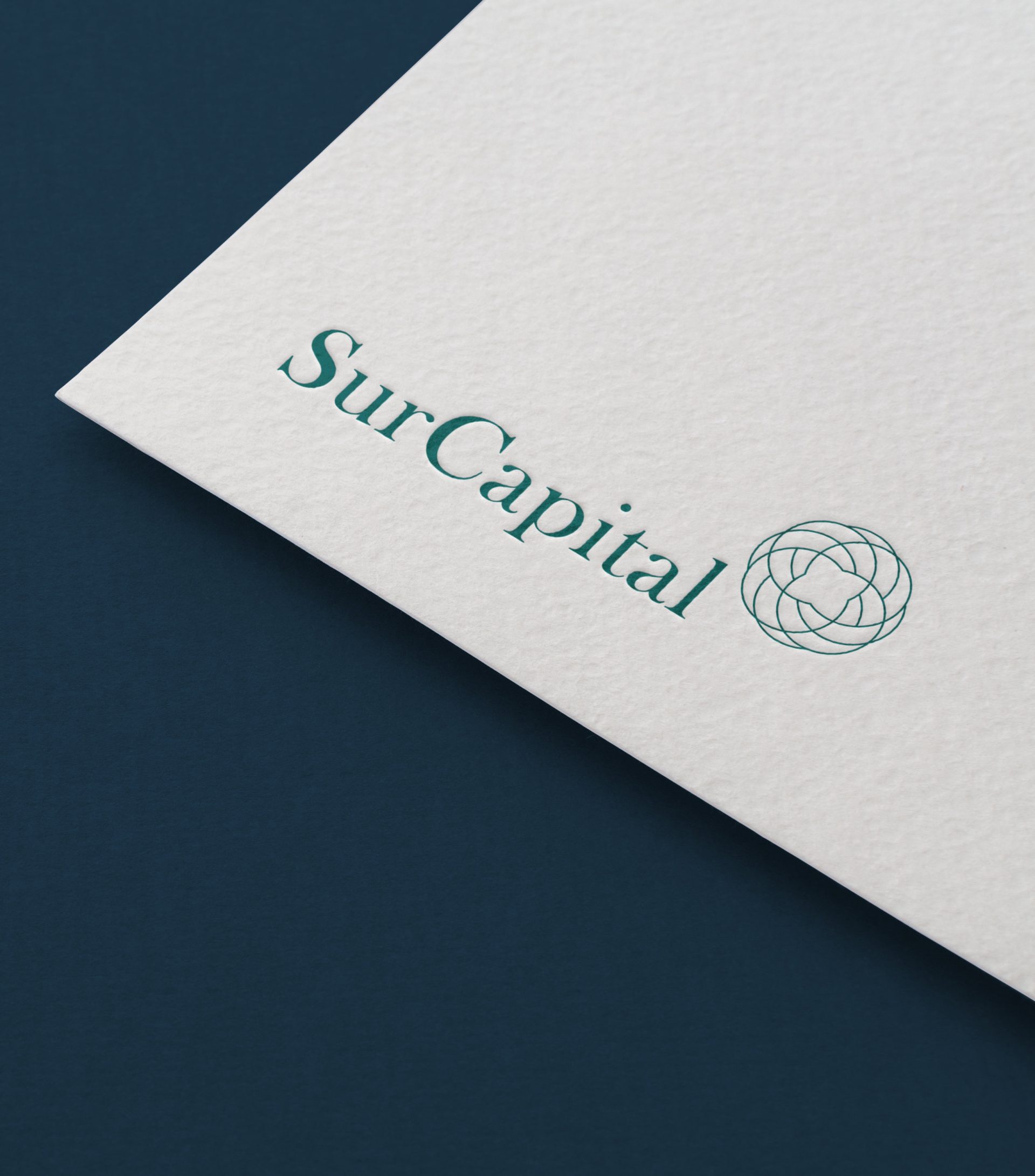
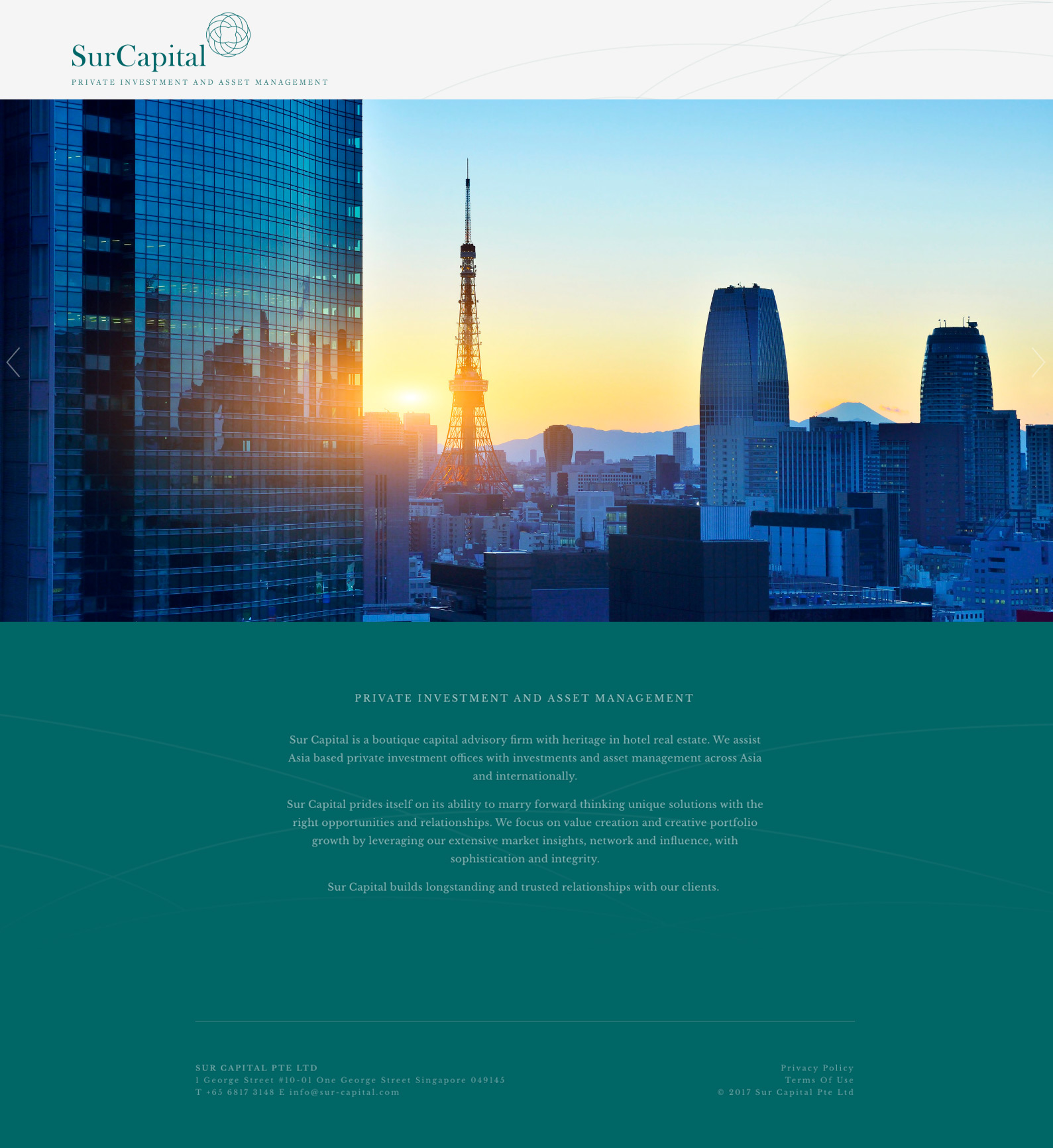
Sur Capital is a boutique capital advisory firm with heritage in hotel real estate. They assist Asia-based private investment offices with investments and asset management across Asia and internationally. Their brand identity, was designed to reflect trust, expertise, and the unique value Sur Capital offers. The eight intersecting rings symbolise the company’s focus on creative thinking and aligning solutions with client needs. The understated yet confident serif typeface was selected for its elegance and balanced negative spaces. Meanwhile, the colour palette takes cues from the deep rich hues of Big Sur, and ties back to the name and ethos of the company, grounding the logo in both nature and tradition.